A property-wide brand identity and compendium for Hyatt Regency Amritsar — and, beneath the hotel's master brand, four distinct restaurant identities: Punjab Province, Scotch Haus, The White Box and Tarteria. One governing system; four very different rooms.
A full-service hotel doesn't have one personality — it has a lobby, a bar, an all-day diner, a deli and a pastry counter, and each wants to feel like its own destination. The brief for Hyatt Regency Amritsar was a master identity disciplined enough to govern the property, plus a family of restaurant sub-brands distinct enough that a guest could love one and never notice the others.
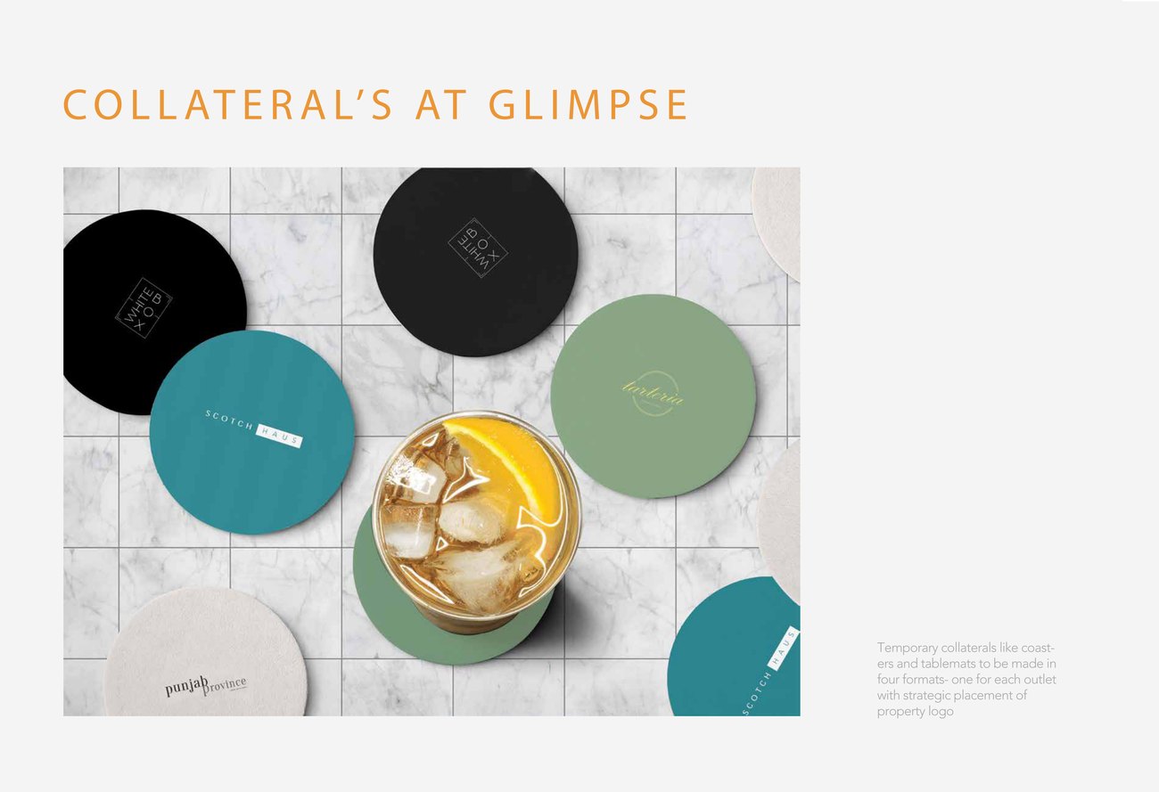
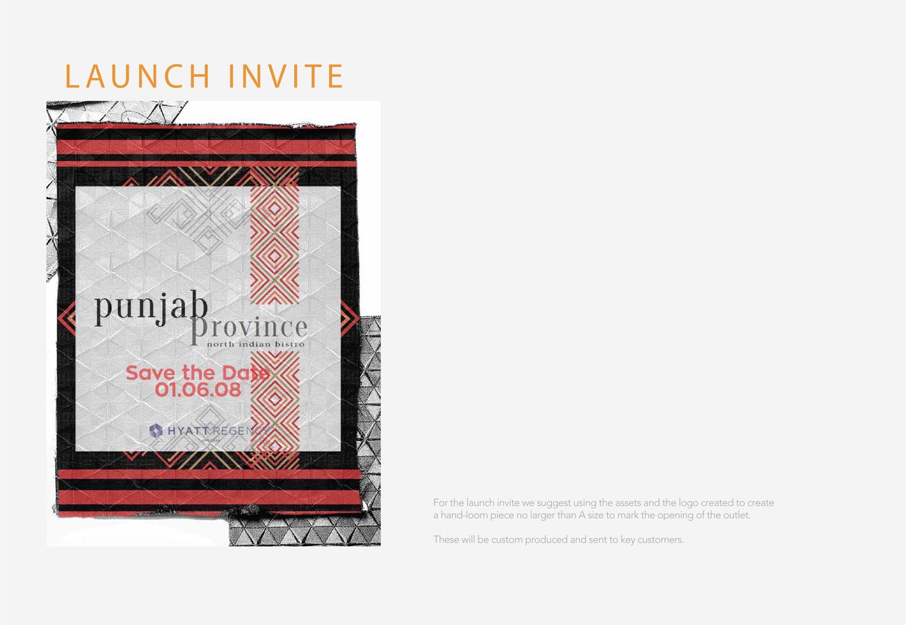
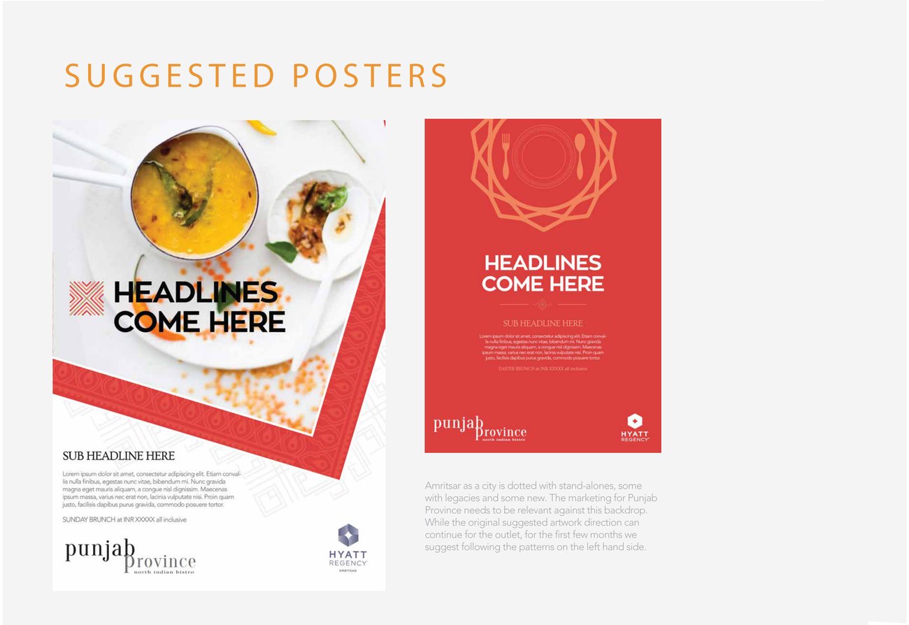
The work runs from a written brand compendium — colour, type, photography, spacing, logo rules — down to coasters, menus, launch invites, posters and tailored uniforms.
Rules first, so freedom later.
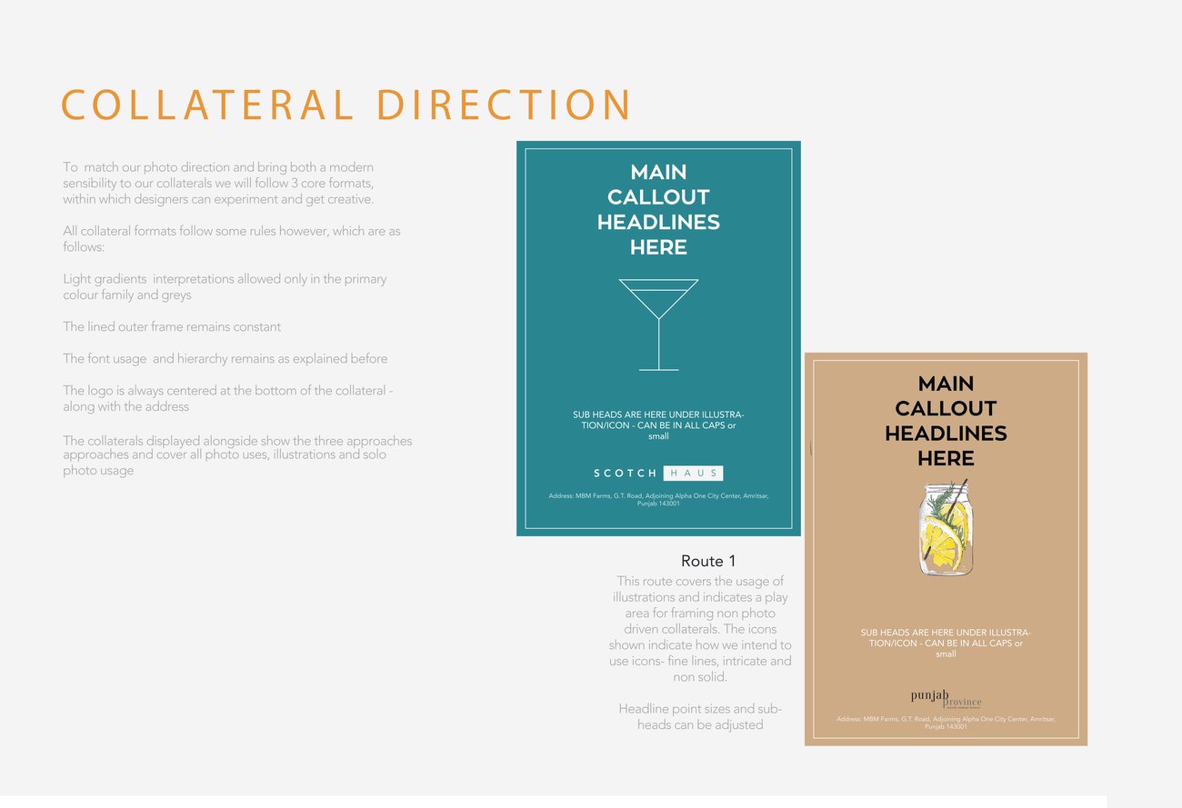
The foundation is a compendium: a single document fixing the property's typography, colour, photographic style and logo behaviour. It's the unglamorous half of identity work and the half that makes everything after it possible — every sub-brand, sign and menu inherits the same grid and the same restraint, so the hotel reads as one place even when its restaurants don't.
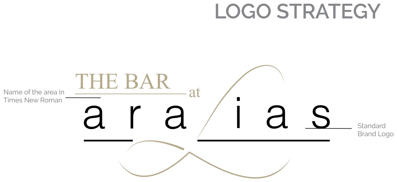
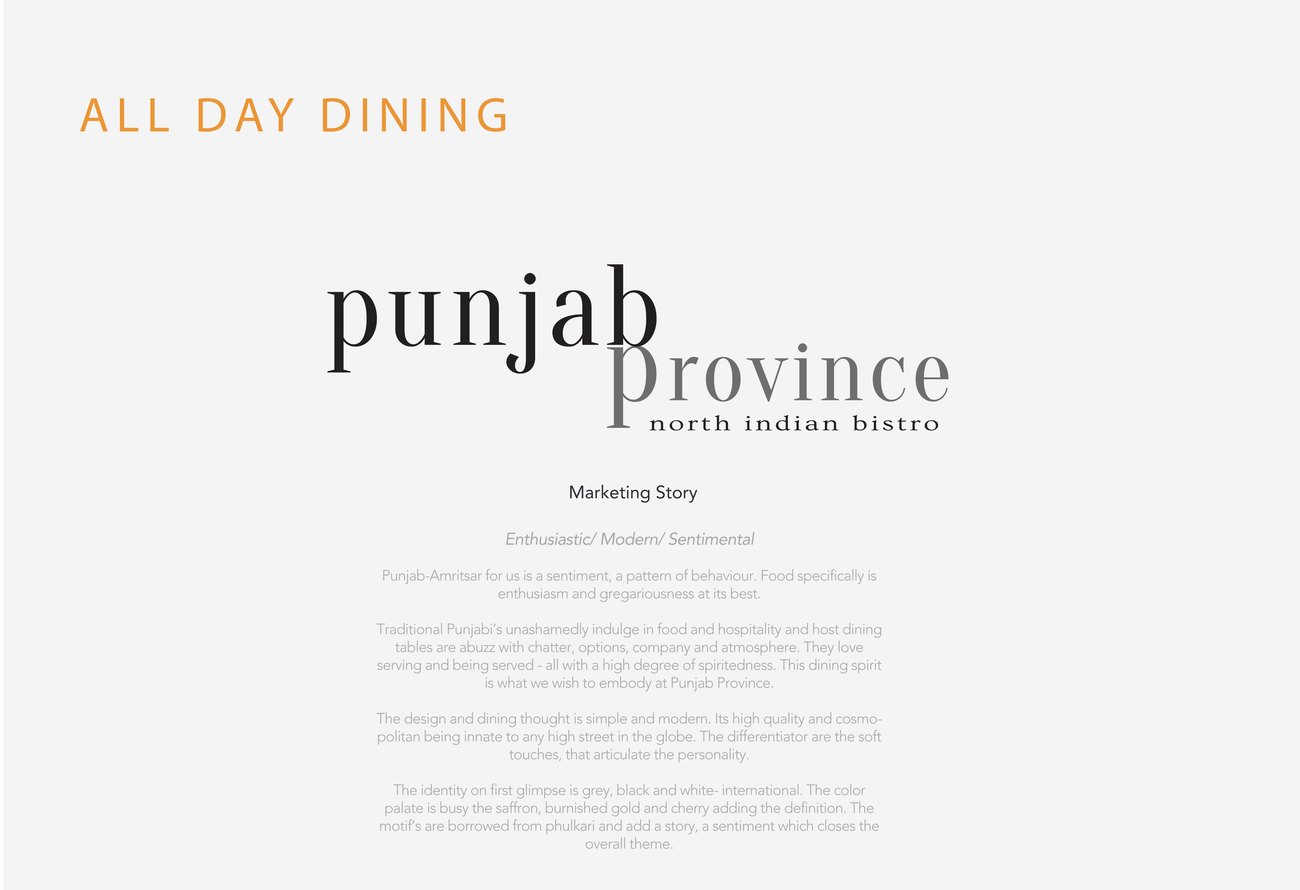
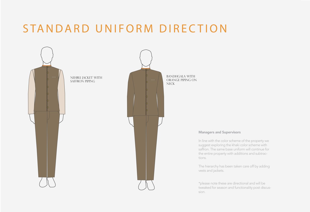
Punjab Province is the all-day north-Indian bistro — a warm serif lockup over "north indian bistro." Scotch Haus is the lounge bar, set in a cool, spaced sans. The White Box is the deli, a literal boxed monogram. Tarteria is the pastry shop, a gold script on sage. Each carries its own colour, menus, stickers, signage and uniform detailing, but all four sit on the master grid — siblings, not strangers.
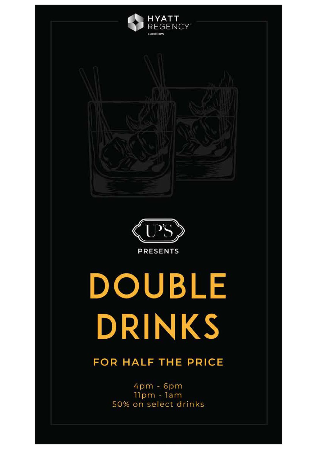
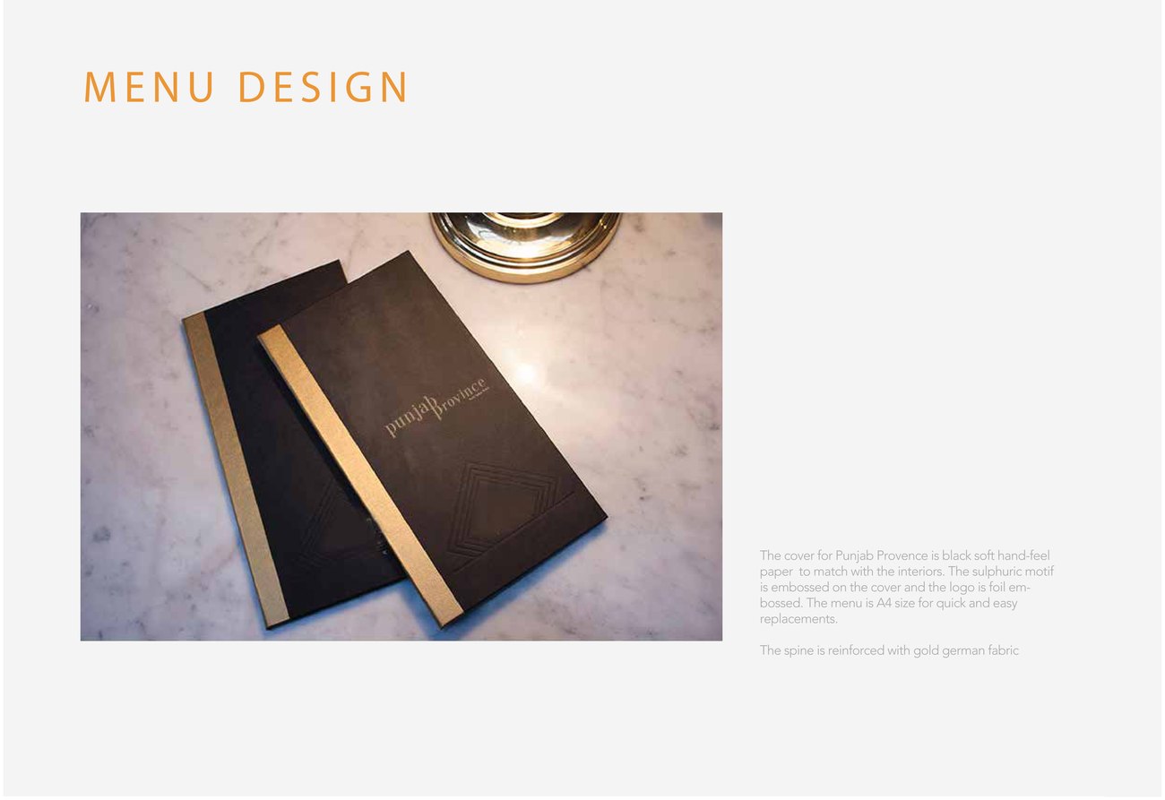
Identity lives or dies in execution, so the system was drawn all the way down: collateral "at a glimpse," launch invites, suggested poster routes, in-room dining cards, bill folders, and bandhgala uniforms specified to the pocket. The point was to hand the property something it could actually run, not just admire.